Two Exhibitions that Didn’t Change My Life, but Did Change My Week:
Even More (as if there weren’t enough) Criticism on David Urban and John Kissick.
*Originally posted in 2004 on samplesize.ca
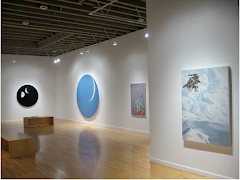
Perhaps more so than any other contemporary painter, David Urban elicits a bi-polar response from his audience. Urban’s vocal (and rather eloquent) arguments for a return to Modernist values and painting practices as well as the support and acclaim that the artist receives for such arguments seems to firmly divide art audiences into those who either vehemently oppose him or those who “believe” in him. And “believe” is indeed the proper description for the level of support that Urban’s poetic longings ask of us. His opening addresses at art talks usually begin with poetry readings and similar lines often accompany his solo exhibitions. (Usually it’s Wallace Stevens, although his recent Moore Gallery show was accompanied by a line from Rainer Maria Rilke.) He is also unafraid of pulling out the old Modernist saw that compares Abstract painting to music (usually Jazz). Above all else, Urban trumpets sincerity and authenticity (as the Jed Purdy of Canadian art) by asking us to disregard our Postmodern cynicism and to suspend our disbelief. This is a difficult task and despite my clever quips, I have tremendous respect for David Urban for having the audacity to ask us to do so.
That being said, I was quite concerned about the prospect of viewing his recent exhibition at the Moore Gallery. His 2002 Art Gallery of Ontario show had been, for the most part, tremendously disappointing. The paintings in that show had the sense of being rushed. Their Riopellish palette-knifing and early Modernist inspired, out-of-the-tube colours seemed woefully second rate and even second year. It is however, arguably, a difficult task for an artist of Urban’s stature to switch gears. Practical obligations such as exhibition schedules and gallery showings (not to mention such trivial concerns as having to eat) force such awkward periods to be made publicly. The works in the AGO show, I hoped, were transitional and as a traditional David Urbanite, I did my best to maintain my belief. I chose to respect him, regardless of the abysmal results, for having had the courage to embark on such a quest and it seems, with his present Moore Gallery exhibition, that he has at least spotted a worthwhile destination.
Perhaps the most striking feature of his recent exhibition, Treats for the Nightwalker, is the works overwhelming sense of confidence and urgency. (These traits are also mentioned by G.M.D in the Globe review and they certainly are the works dominant quality.) The main room at Moore Gallery is filled with large scale works. (The twenty-foot-long, A Toy in The Pond, for L.U., seems custom made to decorate an airplane hangar.) In this new body of work, Urban employs sparse but tremendously bold and emphatic lines, sculpted with a combination of thick and smeary blacks, whites, reds, yellows and blues to elicit feelings of a colossal, primordial struggle. Perhaps a minor detail, but a telling one as to the works heroic intent, is the inclusion of the artist’s initials that are reminiscent of Jackson Pollock’s drip-painting signatures. (Doesn’t he know that you can’t do that anymore, that only high school kids and Robert Bateman sign their work on the front?) David Urban wants you to know that he made these things and he is unashamed of saying so. These works, beyond their poetic titles and musings, are testaments to him as Creator. They are all fire and ice and heaven and hell. They are pure and unapologetic audacity. Unlike most contemporary abstraction which seeks to evoke Abstract Expressionism, these paintings are, in fact, Abstract Expressionism.
As for the display, the works are divided according to hot and cool colour schemes, reinforcing their “Wrath of God” sensibility. The hot (and to my mind more successful) paintings take up three of the gallery’s walls. My one concern with the works installation is the rather off-putting, framed work-on-paper. Although, colour wise, the piece fits in nicely with the other paintings on the cool colour wall, it seems strikingly misplaced in a room dominated by large-scale works on canvas. I can only assume that this was a decision made by the gallery. (The show was apparently “commissioned” by the Moore Gallery, so really they might have made all of the hanging decisions.) Although the monoprint is a nice piece, it really shouldn’t have been included in the front room show and its inclusion, to my mind, signals a very commercial/used-car-salesman/salon-style approach to painting exhibitions which is unfortunate in an otherwise first rate display.
Taken as a whole, the show will certainly serve to reinforce the gap between Urban’s audience and in so doing, stimulate the ongoing debates that such a division creates. For the most part, Treats for the Nightwalker, is a collection of what must be unanimously considered really good, if not “great” paintings. The real question, of course, is whether David Urban was born a half-century too late. Can his work be taken seriously as contemporary revitalizations of Modernist paradigms or are they, like almost everything else (especially at Moore Gallery), merely mannerist variations? Can people still make paintings like that, about those kinds of things? David Urban says that you can and whether you agree or disagree, you have to at least admire the conviction of his claim.
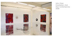
In contrast to David Urban’s bravado is a wonderful survey-says exhibition of recent paintings by John Kissick on view at the Stewart Macdonald Art Centre. Perhaps the greatest quality of John Kissick’s work is its sense of reluctance and insecurity. These qualities might seem unfitting to works that are so vibrantly coloured and often built upon six inch thick wooden panels, but Kissick’s paintings are rigorous investigations of abstractions past that sit on the fence between Urban’s unabashed sincerity and Johnathon Lasker style appropriation. In fact, his works seem to embody this struggle. Rather than claiming to have all the answers, John Kissick’s work presents us with questions.
The show at MacDonald Stewart is an impressive collection of Kissick’s work from 2001-2004. As much as I enjoy his work of 2001 and 2002, his work of 2003 and 2004 are just so much fun. Although the works still employ his older nods to Abstract Expressionism and Eighties style Post-Abstraction (quotations of pre-existing quotations?) his newer work throws OP style and Surrealist tropes into the mix. Everything gets swirled together into a whimsical, alphabet soup of abstract modes.
Although his use of appropriation and self-conscious “nodding” might imply that his paintings are academic or cynical, to my mind, Kissick’s playful works present the idea that although it might not be possible to create a “new” abstract painting, it is possible to create abstract paintings that are “different”. In this way, the paintings of John Kissick are every bit as “sincere” as those of David Urban, but unlike David Urban, John Kissick’s work exhibits doubt and to this, his paintings serve as elaborate testimonials. They are dense and vast, painterly landscapes of overlapping and conflicting ideas and sentiments. John Kissick’s work is a beautiful limbo of paintings past that, to my mind, best epitomize paintings present.
Illuminated Manuscripts (2005)
"Illuminated Manuscripts: Five Things about Alistair Magee
*Originally posted on samplesize.ca
Alistair Magee is a painter’s painter and as such, he is one of the city’s best. His work incorporates the wonderful blend of lush-painterly-expressive and wildly-neurotic-obsessive that best epitomizes the art of painting. His paintings are worked and reworked, painted over and then reworked again. Magee is the eccentric alchemist turning muck into treasure, but he is also the careful monk transcribing the Bible. The following ‘blurb’ is not really meant as a review of Alistair Magee’s recent solo exhibition at Peak Gallery, rather it is a set of connected yet meandering thoughts that attempt to highlight what I feel are five key areas of interest in his work, most notably (but not completely) it’s unique relationship to contemporary discussions of abstraction and representation and the formation of meaning in painting.
1. If there is anyone alive who uses acrylic paint better than Alistair Magee then I simply haven’t seen it. (This is not to say that the possibility does not exist, it’s merely to say that I have not, as of yet, witnessed such an occurrence.) Acrylic paint is easy to use badly, but exceptionally difficult to use well. Perhaps the most impressive characteristic of Magee’s use of acrylics is evidenced in his surfaces. Most acrylic abstractish paintings have very plasticy surfaces. (Mostly because they are, in fact, a plastic surface.) Big clumps of thick paint flatten out into small, soft ridges. (Even John Kissick’s fantastic paintings succumb to this reality of the medium.) Gel mediums and gloss mediums usually form surfaces that look like the glass above the boards at a hockey rink. Magee’s surfaces, however, have a warmth and depth that are more reminiscent of well executed encaustic. Acrylic paints rapid drying time and chemical constitution usually create choppy and abrupt brush strokes (1). Magee’s brush work is swooping, fluid and highly conscientious. Also, the colours in most acrylic paintings are flattened out and hollow, but Magee’s subtle variations, second only in these parts to the better works of Anda Kubis, are somehow able to breathe. Alistair Magee, along with the aforementioned John Kissick, prove that real painters can use acrylic.
2. Alistair’s use of text is interesting and unique. Writer Daniel Baird is right when he states in the catalogue essay that it would be a mistake to think of Alistair’s texts as a purely aesthetic device. Yet it would also be a mistake to think that these paintings are ‘about’ the texts that they offer. Unlike the text paintings of Joseph Kosuth or Richard Prince, Magee’s paintings are principally about painting. His texts draw attention to the well discussed relationship between abstract gestures and written characters (2), a relationship well illustrated by the more graphic paintings of artists such as Robert Motherwell, Yves Klein, Harold Town and Jackson Pollock. But more like the alphabet and number paintings of Jasper Johns, Magee’s work reminds us that written characters are, in fact, abstract gestures and that their meanings have been arbitrarily assigned. In a parallel world maybe Q means T. (Maybe dog means cat?)
3. Would it matter if Magee’s paintings were not painted in English? Would they come across differently in China? In many parts of Toronto business signs don’t come with an English translation. They use weird letters. I don’t know whether they read left to right, up to down or down to up. I often wonder about those signs and the potential messages they might carry. Maybe they aren’t even business signs at all. Maybe they are warnings of catastrophic danger. (Maybe they are not.)
4. Alistair Magee’s paintings are painted in English, but his words are buried, blurred, dense and or fragmented. They are usually difficult and often impossible to decipher. It is significant that these are found texts. Letters found on the street. Crib notes at the library. Sometimes the title conveys the source, sometimes it doesn’t. The spectator is left to speculate on their meaning, just as the artist often must with their source. Because of this, Alistair’s voyeuristic texts carry a profound emotional resonance that is similar to that created by British sculptor Rachel Whiteread. For like Whiteread, Magee’s works are haunted by the ghosts of other people’s memories.
5. The manner in which Alistair Magee reproduces his texts is also significant. They are projected and outlined with green, house-painters tape, the shape of each letter faithfully retraced in a process similar to cardboard-cut-out-low-fi screen printing. Beyond the obvious, pain-in–the-ass labor that this process surely represents (my protestant upbringing and art history class has taught me that there is divinity in labor) it is also significant because it preserves the integrity of the original document. This process displays a respect for his subject that is uncommon in contemporary practices. These discarded letter fragments and crumpled up memos are cherished by Magee. He invests as much attention into their subsequent illumination as a medieval monk with his manuscripts. Taken as a whole, Alistair Magee’s process causes a sort of leveling out of lived experience by placing a special importance on the everyday and inconsequential. Like the famous “date paintings” of On Kawara that raise the significance of September 11, 2000 to that of September 11, 2001 (3), Magee’s paintings manage to raise the significance of the grocery list to that of the written will.
Phillip Guston once said that the act of painting is like having both of your hands stuck in a mattress. The idea being (I think) that painting is about a subtle discomfort. Not merely a matter of filling in spaces with appropriate colours and textures, it is a process of working and reworking, painting over and reworking again. To Guston, painting was about a soft struggle, a struggle for resolution. Alistair Magee’s works embody this sort of soft struggle, for buried somewhere within the muck and grime of these materials lies the gold that he’s searching for.
-Pete Smith, 2005
(1) Once they’re there. They’re there. You can’t fiddle with them an hour later. You can paint over them, but the scars will remain.
(2) I’m pretty sure that there’s a section in Rosalind Krauss’ “Optical Unconscious” (the part about Pollock?) that’s devoted to this discussion. It also might have been in Briony Fer’s “On abstract art”. Wherever it was that I read it, I remember it being quite interesting and largely true. Regardless, the abstract gesture/written character discussion has become part of the quasi-academic mush that floats around in my brain.
(3) This is meant merely as a universally understood example. I could have used January 1, 2000 and January 2, 2000. Please pretend that I did.
Buying Abstract Art (2004)
5 Important Reasons Why You Should Buy Abstract Paintings.
*This article was published in April 2004 on samplesize.ca.
1. Decoration.
Abstract paintings are often quite pretty and are decoratively versatile. Abstract paintings come in all shapes, sizes and colours and can visually enhance even the most delicate of interiors. In fact, one of the world famous designers from TV’s Trading Spaces often creates abstract art (on the cheap!) for his interiors. The home owners are almost always impressed by his subtle blends of drift wood and polished steel. It should be noted, of course, that he is a professional artist. Abstract painting takes years of practice and hard work. It is much easier and rewarding to buy your abstract paintings from a professional artist.
2. Affordability.
Abstract paintings come in all price ranges to match almost any income. You can spend fifty dollars or fifty million dollars! It’s really up to you to decide how much money you want to spend on your abstract paintings and if you spend wisely, you will never be disappointed!
3. Sophistication.Abstract paintings are great conversation pieces. They inform your guests that you are “in the know”. An abstract painting in your home tells your guests that you are, in fact, a savvy and knowledgeable intellectual, that you actually understand and appreciate “modern art”. Abstract paintings ooze sophistication.
4. Collectability. Like real estate or the stock market, abstract paintings are also a great investment. Some of them even sell at famous auction houses for more than fifty million dollars! Sometimes the original buyers only paid a loaf of bread and a case of beer for their abstract paintings. That’s 49.99999 million percent interest over a period of roughly fifty years. That’s nearly one million percent interest per year which is far better (roughly 999,996% better) than what is offered by every bank in the world!
4a. Choosing Your Abstract Paintings: Simple Strategies for Successful Art Buying.Picking your abstract paintings is a difficult skill. There are a lot of abstract artists out there and it takes a keen eye, extensive research and a little bit of luck to be a successful art buyer. Like the stock market, you should try to identify “blue-chip” prospects:
• Try to find younger artists (ie. early thirties) who have already demonstrated a reasonable degree of artistic proficiency. Look for successful reviews in art periodicals and newspapers, gallery representation, a master’s degree or even all three. These are important indicator’s that you’ve found a “blue-chip” abstract painter.
• Try to find artists who live in the United States, preferably New York City or Los Angeles. Abstract painters from London, England are also desirable.
• WARNING: Do not buy abstract paintings from Paris! France has not produced collectable art for more than fifty years! Also, do not buy abstract paintings from: Ireland, Scotland, Italy, Portugal, Greece, Hungary, Poland, Canada, Australia, Austria, Sweden, Russia or any other formerly Soviet State, Japan, China, Uruguay, Spain, Sweden, Switzerland or Iceland. And I really can’t stress this point enough: Never buy any art whatsoever, abstract or otherwise, from a third-world country.
• Try to get a sense of the artists mental constitution and emotional well-being. If you ever witness an abstract painter urinate into a fire place, you should probably buy a couple of paintings. If you even remotely suspect that an abstract painter might be suicidal, you should buy as many of their paintings as you can afford! Dead artists paintings often double or even triple in value right after they die because they can’t make any more abstract paintings. This gives you a privileged position because there is now a limited and finite number of this artists work available. The production supply has come to a drastic halt and consequently the overall demand will significantly increase.
4b. Potentially Immanent Death Indicators as Factors of Collectability.
Bruises and or scabs on their arms.
• Often referred to as “track marks”, this is a sure fire sign of addiction to hard drugs. Abstract artists who are addicted to hard drugs usually die young. (Note: if your abstract artist enters a rehab clinic, don’t panic! Most rehab doesn’t work and your abstract painter will be back on drugs in no time.)
Severe Alcoholism.
• Not nearly as effective as an addiction to hard drugs, however, alcoholism usually contributes to depression and possibly even suicide. It also contributes to the bizarre and erratic behaviors traditionally associated with the artist’s “bohemian lifestyle” This behavior can help to create a “mythification” of your abstract painter and you never know, maybe they’ll try to drive a car or just wander onto the street and get hit by one!
5. Gifts.
Finally, abstract paintings make great gifts. You can often buy small ones for cheap just before Christmas. Abstract paintings, unlike a lot of other “modern art”, doesn’t have any political or social agenda to potentially annoy your loved ones. You can give abstract painters to both conservatives and democrats alike and believe me, everyone will be very happy that you did.
The Saddest Music in the World (2006)
The Saddest Music in the World
Roger Ebert loved this movie. As the reigning Oprah Winfrey of film criticism, Mr. Ebert packs a tremendously large thumb within the popular conscience, and the pair of Fonzies that he and his sidekick have bestowed upon Guy Madden’s The Saddest Music in the World goes along way towards identifying this films strongest feature. Madden’s films traditionally occupy a fuzzy domain between art video and cinema, fitting comfortably into neither domain. They are (mostly) too long to watch in an art gallery and too boring to watch at home (where the temptation to turn the channel to a rerun of Everybody Loves Raymond is simply too high for such unapologetic self indulgence.) The Saddest Music however, trades in silly plot devices and ridiculous characters for ones that are quirky, original and compelling. More importantly, however, Madden trades in oblique autobiography masked as high minded “conceptualism” for genuine metaphor and broad social commentary. In essence Guy Madden, eccentric “avant guardian” and amateur’s auteur, has with The Saddest Music in the World, made a real film.
The film is set in a Depression era Winnipeg winter and is shot mostly in black and white. (Fittingly the films Wizard of Oz/Schindler’s List/Chromophobia moment of colour occurs during a funeral.) The plot revolves around a Willy Wonka style contest wherein a local legless beer Baroness (Isabella Rossellini) is in search of the world’s saddest music. Performers from around the world travel to Winnipeg in hopes of winning the grand prize of “25,000 Depression era dollars”. A bizarre love pentagon emerges between the Baroness, a quasi-American musical producer (Mark McKinney), an amnesiac nymphomaniac (Maria de Medeiros), a retired Canadian soldier/drunken disgraced doctor (David Fox) and a pseudo-Serbian cellist (Ross McMillan). As per usual in Madden land, most of these participants are physically or legally related to one another, although Madden’s love of all things Oedipal is noticeably less pronounced here than in his other films. Strong performances are turned in by all of the principles, most notably by Mark McKinney who seems to have become Canadian film and televisions resident morally-ambiguous-corporate-slime-ball (see Brain Candy and the more recent and fabulous Slings and Arrows). His role here as the American contestant continuously attempting to bribe his competition, is a wonderfully satirical commentary on American corporate culture in general and the Hollywood film apparatus in specific.
For me, however, the most interesting aspect of The Saddest Music in the World is Madden’s understanding and commentary on the role that the projection of national identities and stereotypes plays in shaping the individual identity. Each musical group performs (brilliantly) in a stereotyped version that is “representative” of their country. It is the stuff of airport lobby shops (ie. duty free maple syrup). These notions are generally laughed off by all local participants. But how important and attractive are these myths? (My Irish friends groan with mere mention of the word Leprechaun. Yet they will also, if the topic is accidentally broached, tell you that Leprechaun’s are no good bastards responsible for all sorts of mischievous acts throughout the Irish countryside. Don’t even get them going about the Banshee.) How much of our notions of self are dependent upon such constructs? How deep do they individually run? The Saddest Music in the World offers many possible suggestions.
The Saddest Music in the World is a film that I was not expecting to enjoy. Guy Maddin is like porno for filmophyles and this is something that I am decidedly not. (Although I do love movies, particularly those with fast car chases, loud explosions and gratuitous female nudity.) But as the Ebert and Roper endorsement would possibly suggest, this is Madden’s most accessible venture to date. It fits in and holds up nicely with the better and weirder auteurs of mainstream contemporary English language cinema such as Lars Von Trier, Hal Hartley, any of Charlie Kaufman’s scripts (directed by whomever), David Lynch and either of the Andersons:
Pete Smith liked this movie.
On Kawara: Sunday Painter (2006)
On Kawara: Sunday Painter
At The Power Plant Contemporary Art Centre
Toronto
November 12, 1967
Marilyn Clink and Laurie Smith are first year undergraduates at Waterloo Lutheran University. Marilyn is from Toronto and majors in mathematics while Laurie, from Newmarket, studies geography. They met at a school social the month previous and are fast becoming good friends. On this day, Laurie and Marilyn are both attending chapel. Laurie is a trained singer. He is somewhat religious, but mostly attends chapel religiously so that he can sing in the choir. He loves to sing. Marilyn is also somewhat religious or at least her father, Allan, says grace before every meal. Marilyn mostly attends chapel on Sundays to hear Laurie sing, or rather, to watch him sing. Today he is performing the Lord’s Prayer as a solo. He has a beautiful voice. It fills the room. His chin strains and his neck trembles as he resonates in perfect pitch. His body is taught as he reaches the hymns grand crescendo. Then there is silence. The congregation does not applaud a church performance. God however, is supposedly clapping. Laurie sits back down amongst the choir. Marilyn is smiling in her pew. On this day, eight years later, John Laurie Smith and Marilyn Elizabeth (Clink) Smith will have their first child. He is seven pounds and eight ounces. They name him Peter.
December 24, 1978
I am three years old and I’ve finally got this whole Christmas thing figured out. There’s this really nice big fat old guy who wears pretty much exclusively red, has a long white biker style beard and brings presents to all of the kids around the world. He works the rest of the year, along with his team of highly trained and efficient magical elves, making all of this stuff whilst recording and tracking the naughty/nice behavior patterns of the world’s youth. I am convinced that Clint Bolger, my best friend, has absolutely no hope of receiving anything at all this year. I am hoping however that Santa, in his infinite wisdom and benevolence, can overlook my reluctant participation in the infamous throwing of crab apples into Bobby Best’s swimming pool incident. (It made great splashing sounds!) At least when I talked to Santa at the mall, he seemed relatively willing to listen. This year I am hoping for as much Star Wars paraphernalia as elf-inly possible. Luke Skywalker is the only action figure that I would articulate as truly “necessary”, yet Han Solo and Darth Vader are pretty important components to any real Star Wars adventure. They also, of course, need some kind of vehicle (or two) to get around the galaxy/sand box.
February 16, 2005
I am given a ride home by one of my professor’s along with a visiting artist who is giving a talk tonight at the Power Plant. I’d been meaning to check out the show for awhile, mostly because some friends have stuff upstairs in the Cold City show. I was decidedly less intrigued by the prospect of seeing the works by On Kawara. I felt that his famous “date paintings” were one-trick-ponies that offered little benefit to actually seeing them first hand. Conceptual one-liners are like magic tricks, once you know how they work there seems little point in witnessing their actual incantation. Because of this preconception, I was completely unprepared for the melancholic weight that Kawara’s work powerfully resonates. Firstly, these paintings aren’t all the same. They are in different scales and fonts. There are minute variations in tone and hue. Each painting seems to have subtle imperfections, tiny moments where the artists hand is clearly visible. These calculated indiscretions provide the work with a touch of humanity, transforming the cold transference of fact and information into something personal and introspective. For there is something deeper that lurks behind these characters. Walking though this collection of On Kawara’s date paintings is like walking through a grave yard. These paintings seem haunted. If a photograph is, as Barthes famously stated, “a death mask of a moment”, then Kawara’s paintings are tombstones of a day, with the date alone standing as epitaph. Like most good work, these paintings understand that meaning is created less by the artist than by the viewers, who bring with them the various dramas of their own memory and experience. Where was I on July 6th, 1980? What happened on that day? Was it the same as any other day? The paintings in this exhibition are heavily loaded with these sorts of resonances because On Kawara’s palette is not the mid-value grey of these monochromes but is rather the expansive palette of our memory.
Not For Sale (2007)
Not for Sale
Curated by Alanna Heiss
at PS1
NYC
Call it the Benjamin effect, but I’ve never felt that The Mona Lisa was a particularly interesting painting. The stories that surround it, however, are of course wildly captivating. My favorite of these stories revolves around the fact that Leonardo kept the work until his death. He took it with him wherever he traveled. In a lifetime of acclaim and commissions, this one was for him. It was his. The Mona Lisa was not for sale. I think that this is something that all artists can relate to. Works come and go. Things are bought and sold, lost and destroyed. Putting together a slide package is like flipping through a photo album dedicated to former lovers. Most of them make you cringe. Some of them make you proud. Then there’s the one that you held onto a little bit longer than the rest.
The curatorial premise of the current exhibition at P.S.1 is clearly embodied in its title, “Not for Sale”. It features an impressive collection of works by an impressive collection of artists. As an added bonus, most of the works are accompanied by a short explanatory statement that describes the artists relationship to that work. These rationales are as varied as the works. There are three framed Peter Halley drawings from 1980 that clumpily but implicitly depict prison cells. Halley has kept them because they were the first sketches that dealt with what would later become his major work. Looking at them, you can almost feel the light bulb going on. A work by Richard Prince from 2004 titled “Untitled Publicity” entails a glamorous and glossy Nicole Kidman headshot that she has signed “To Richard. Love Nicole.” There is an uncashed cheque written out to Prince from Paramount Pictures that is also mounted in the frame. Prince had rented some works for Paramount’s remake of The Stepford Wives. The piece is touching in a dorky-but-honest-sort-of-way. After all, even art stars get star-struck. There is a whole room of Richard Tuttles that are characteristically Tuttle-ian (ie. small and awkward and beautiful and weird.) These works, however, are the only works in the show that are not “courtesy of the artist”. They have been provided by Tuttles wife the poet Mei-Mei Berssenbrugge. Matthew Ritchie’s stunning 2003 triptych-on-paper 5 of a kind is a baroque explosion of washed blues and mudded browns with jutting streamers of lemon yellow and faded ochre. As part of his personal history of the universe, these works characteristically create a map of a self-reflexive, semiotic evolution. Yet he made this piece while his wife was pregnant, and so it came to deal with another sort of evolution as well. He is keeping the piece for his son.
Not all of the works are successful. Not all of the stories are interesting. Alex Katz’s 2005 portrait Kate has (allegedly) been kept because it fits in well with his condominium décor. Dana Schutz’s portrait of her husband is second year undergrad material. It’s one- layer-thick, get-it-right-the-first-time and random-colours-while-wearing-a-blind-fold sensibility are cliché and trite. And although her supporters would say that this is the point, it’s a point I’m tremendously tired of seeing. Jeff Koons Popeye of 2003 is an incredibly slick yet utterly vacuous re-visitation of Rosenquist-minus-the-masking-tape-style pop. His “assistants”, however, really are quite talented. Julian Schnabel’s monolithic-elegiac Cortes of 1988 is a nice piece but can’t live up to the loftiness of its placard. Schnabel describes the work as representing “the fundamentals of being.” (Personally, I find it difficult to connect his use of ripped burlap to a sense of ontological stability.)
The best of the bunch, however, belongs to Eric Fischl. It is a modestly scaled and untitled work from 2001. A female nude reclines on a bed. Her hand rests between her opened thighs in a gesture that neither conceals nor invites. She slips back into the darkness of deeply layered browns and blues that drip and wash and matte and shine. Looking back into these painterly shadows, her gaze is concealed. The creamy pinks of her body meander into lush loose strokes of refined confidence. There is a dignity here. This painting speaks with a frankness and candor that is neither contentious nor provocative. It is disarming in its honesty. His statement reveals a similar candor that to my mind, encapsulates the sentiments that the best of the works in this show demonstrate:
“Every once in a while, I make a work that reveals (to myself) a tenderness, a simple expression of love that I did not thing I was capable of making. When this occurs, I am in no rush to bring the lamb to market.”
As a Canadian artist it is easy to target the American art market and its continuous carousal of self-righteous-self-importance. History, after all, would seemingly lie in the balance of its cheque books. The “Not for Sale” show manages, despite the grandeur of its own celebrity, to touch on the core of art production. There is a gooey centre here beneath the hardened candy. Even Jeff Koons has his Mona Lisa’s.
Subscribe to:
Posts (Atom)